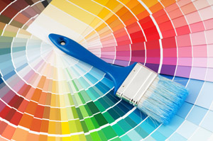
Colour - symbolism, decorating tips and interesting facts
Color is more than a combination of red, green, and blue or cyan, magenta, yellow, and black. It is non-verbal communication.
Colors have symbolism and meanings that go beyond ink. As you design your house or appartment it is helpful to keep in mind how the eye and the mind perceive certain colors.
Sometimes colors create a physical reaction (red has been shown to raise blood pressure) and at other times it is a cultural reaction (in North America and Europe white is for weddings, in some Eastern cultures, white is the color for mourning and funerals). Colors follow trends as well. Avocado, a shade of green, is synomous with the 60s and 70s in the minds of some consumers.
On the next few pages we'll explore the symbolism of different colors.
- Cool Colors (calming): Blue, Green (& White)
- Warm Colors (exciting): Red, Yellow, Orange (& Black)
- Mixed Cool/Warm Colors: Purple
- Neutral Colors (good for backgrounds): Brown, Tan, Beige, Gray, Silver, Black, White
-
Fast Facts about Color Symbolism:
- Red - love and war
- Yellow - hope, happinness
- Orange - flamboyant, energetic
- Blue - calm, cool
- Green - life, renewal
- Purple - royalty, spirituality
- Brown, Tan, Beige - down-to-earth
- Grey, Silver - elegance, neutrality
- Black - conventional, mysterious; White - purety, cleanliness, innocence
Red and Pink
Red is hot. It's a strong color that conjures up a range of seemingly conflicting emotions from passionate love to violence and warfare. Red is Cupid and the devil. A stimulant, it's the hottest of the warm colors.
Studies show that red can have a physical effect, increasing the rate of respiration and raising blood pressure. Use red to grab attention and to get people to take action.
Red is power, hence the red 'power tie' and the 'red carpet' for celebrities and VIPs (very important people). Use red when you don't want to sink into the background. Use red to suggest speed combined with confidence and perhaps even a dash of danger. Red is the color of happiness and properity in China and is often used to attract good luck. It is often the color worn by brides in the East.
In combination with green, red is a Christmas color — a joyful season. In some cultures, red denotes purity, joy, and celebration.
Pink is a softer, less violent red. Pink is the sweet side of red. Both colors denote love but while red is hot passion, pink is romantic and charming. Use pink to convey playfulness (hot pink flamingoes) and tenderness (pastel pinks).
- Harmonizing colors for red: Magenta and Yellow harmonizing (adjacent) colors often work well together but if too close in value they can appear washed out or not have enough contrast
- Complementary colors for red: Purple and Green complementary colors printed side by side can cause visual vibration making them a less then desirable combination.
- Opposite color for red: Cyan (Blue) colors that are opposite each other on the color wheel are said to clash — not always a bad combination if used carefully
Yellow and Gold
Yellow is sunshine. It is a warm color that, like red, has conflicting symbolism. On the one hand it denotes happiness and joy but on the other hand it's the color of cowardice and deceit.
Use the color to lift spirits and project optimism. For years yellow ribbons were worn as a sign of hope as women waited from their men to come marching home from war. Today, they are still used to welcome home loved ones. Because of the high visibility of bright yellow, it is often used for hazard signs and some emergency vehicles.
Use yellow to perk up a more subdued palette of blues and grays. Use lemon yellow with orange to carry out a healthy, summery, citrus theme.
A cousin to yellow (and orange and brown) is gold. While green may be the color of money (U.S. money, that is) gold is the color of riches. While 'all that glitters is not gold' the color gold still suggests grandeur, and perhaps on the downside, the excesses of the rich. Glittery gold denotes richness from money while an earthy, orange gold can suggest more emotional riches from family and friends.
- Harmonizing colors for yellow: Red and Green
- Complementary colors for yellow: Magenta and Cyan
- Opposite color for yellow: Blue
Orange is vibrant. It's a combination of red and yellow so it shares some common attributes with those colors. As a warm color it is a stimulant -- stimulating the emotions and even the appetite. It denotes energy, warmth, and the sun. But orange has a bit less intensity or aggression than red, calmed by the cheerfulness of yellow.
If you want to get noticed without screaming, consider orange — it demands attention. The softer oranges such as peach are even friendlier, more soothing. Peachy oranges are less flamboyant than their redder cousins but still energetic.
Orange brings up images of autumn leaves, pumpkins, and (in combination with Black) Halloween. It represents the changing seasons so in that sense it is a color on the edge, the color of change between the heat of summer and the cool of winter. You might use shades of orange to indicate transition or a bridge between two opposing factors.
Orange is also a citrus color. It can conjure up thoughts of vitamin C and good health and while orange is often synonymous with autumn, the brighter oranges are a summer color.
Orange is mentally stimulating as well as sociable. Use it to get people thinking or to get them talking.
- Harmonizing colors for orange: Red and Yellow
- Complementary colors for orange: Dark Pink and Yellow-Green
- Opposite color for orange: Medium Blue
Blue
Blue is calming. A natural color, from the blue of the sky, blue is a universal color. In many diverse cultures blue is significant in religious beliefs, brings peace, or is believed to keep the bad spirits away.
The cool, calming effect of blue makes time pass more quickly and it can help you sleep. Blue is a good color for bedrooms.
A deep royal blue or azure conveys richness and perhaps even a touch of superiority. Navy blue is almost black. It conveys importance and confidence without being somber or sinister, hence the blue power suit of the corporate world and the blue uniforms of police officers. Long considered a 'corporate' color, blue is associated with intelligence, stability, unity, and conservatism.
Combine a light and dark blue to convey trust and truthfulness — banker's colors. Mix blue with green for a natural, watery palette. Lighter sky blue and robin's egg blue, especially when combined with neutral tans or beige are environmentally friendly color combinations.
Although blue is a year-round color, pastel blues, especially along with pinks and pale yellows suggest Spring. Throw in a dash of blue to cool down a hot red or yellow scheme. Or warm up a blue palette with a dash of attention-grabbing red.
- Harmonizing colors for blue: Magenta and Cyan
- Complementary colors for blue: Red and Green
- Opposite color for blue: Yellow
Green and Teal
Green is life. Abundant in nature, green signifies growth, renewal, health, and environment. On the flip side, green is jealousy or envy (green-eyed monster) and inexperience.
Green is a restful color with some of the same calming attributes of blue. Like blue, time moves faster in a green room.
With both a warming and cooling effect, green denotes balance, harmony, and stability. Green with blue produces echoes of nature -- water and forest and can denote new beginnings and growth. Green with tan or beige says 'organic' or 'recycled.' Green can convey quiet contemplation. In the U.S. green is money and good luck.
Green is associated with Spring and (when combined with red) Christmas. For designers, it important to remember that for all the positive attributes of green there are many strong negatives or opposites associated with the color as well. Know your audience before using green.
Teal, a mix of blue and green, is a bit livelier than either color alone. It carries a touch of sophistication and richness.
- Harmonizing colors for green: Cyan and Yellow
- Complementary colors for green: Blue and Red
- Opposite color for green: Magenta
Purple and Lavender
Purple is royalty. A mysterious color, purple is associated with both nobility and spirituality. The opposites of hot red and cool blue combine to create this intriguing color.
Deep or bright purples suggest riches while lighter purples are more romantic and delicate. Purple is associated with creativity and moodiness, perhaps because of the conflicting red and blue base.
A deep eggplant purple with neutral tans or beige is an earthy, conservative color combination with a touch of the mystery that purple provides.
Purple has a special, almost sacred place in nature: lavender, orchid, lilac, and violet flowers are often delicate and considered precious. Purple might suggest something unique or extremely special, but with an air of mystery.
Lavender has long been a favorite flower and color of genteel ladies. This shade of purple suggests refinement. Lavender may be a good choice when you are targeting women and want to invoke feelings of nostalgia or romance.
- Harmonizing colors for purple: Magenta and Blue
- Complementary colors for purple: Dark Pink and Medium Blue
- Opposite color for purple: Green
Brown, Tan and Beige
Brown is a natural, down-to-earth neutral color. It is found in earth, wood, and stone.
While brown conveys a wholesome earthiness, it's darkest and lightest shades from chocolate brown to pale beige and golden-brown are rich, refined, even elegant. It is a warm color that can stimulate the appetite. Some of the positive attributes of brown are simplicity, friendliness, dependability, and health.
Brown and its lighter cousins in tan, taupe, beige, or cream make excellent backgrounds helping accompanying colors appear richer, brighter.
Shades of brown coupled with green are an especially earthy pair, often used to convey the concept of recycling or earth-friendly products.
Beige, can take on some of the attributes of yellow or pink when touched with those shades.
Gray and Silver
Gray is a neutral, balanced color. It is a cool, conservative color that seldom evokes strong emotion although it can be seen as a cloudy or moody color.
Dark, charcoal gray carries with it some of the strengh and mystery of black. It is a sophisticated color without some of the negative attributes of black.
Silver, especially a shiny, metallic silver, is cool like gray but livelier, more playful. Silver coupled with turquise evokes the Southwest (U.S.). Silver can also denotes riches, just as gold does. Silver can be earthy, natural or sleek and elegant.
Taupe, a grayish brown neutral is a conservative, slightly earthy color.
Gray and silver work well with other cool colors such as blue or teal.
The other neutrals: Brown, Tan, Beige, Black and White.
Black and White
Black and White are opposites that share the attribute of neutrality.
Considered the negation of color, black is conservative, goes well with almost any color except the very dark. It also has conflicting connotations. It can be serious and conventional. Black can also be mysterious, sexy, and sophisticated. In most Western countries black is the color of mourning. Among young people, black is often seen as a color of rebellion. Black is both positive and negative.
Black is the ultimate dark color and makes lighter colors such as yellow really pop out. Photographs often look brighter against a black background.
White is purity, cleanliness, and innocence. Like black, white goes well with almost any color. It especially contrasts well with dark colors such as red, blue, or purple. In most Western countries white is the color for brides. In the East, it's the color for funerals. White is often associated with hospitals, especially doctors, nurses, and dentists.
In most cases white is seen as a neutral background color and other colors, even when used in smaller proportion, are the colors that convey the most meaning in a design.
To the human eye, white is a brilliant color that can cause headaches for some. Too much white can be 'blinding.' Some neutral light beiges and creams carry the same attributes as white but are more subdued, less brilliant than plain white.
10 Colour Decorating Tips
- Decide to enrich your life. Start with color!
- If you want to try something colorfully bold, introduce it in small amounts first.
- Colors that work in harmony together, such as lighter or darker shades of the same color are naturally comfortable to the eye.
- Dynamic color combinations are pairings of complementary colors such as red and green.
- Color can underscore architectural detail, as the painted moldings of Williamsburg rooms or island houses painted in their happily contrasting colors.
- Establish continuity by using the same color in several rooms, altering the shade.
- Most designers prefer white moldings throughout the entire house unless there is a specific color scheme with contrasting moldings.
- When painting a room two colors, save the darker shade for the main wall. Never balance the colors fifty-fifty; it will rob the focal point.
- White, lavender, and pale blues and greens soothe - good for bedrooms, kitchens and baths.
- Dark ceilings do not make a room look smaller. The opposite is true. Darker ceilings push walls outward thereby increasing the perceived size of the space.
Interesting Facts about Colour
- Genghis Khan forever impacted Eastern porcelain by introducing the Chinese to cobalt blue which he carried from Iran.
- Missionaries shared the secret of pink with the Chinese. They fired gold to a certain temperature until it turned pink. If fired at another temperature, it turned purple!
- The most evenly balanced light is daylight having almost equal parts of all the colors of the spectrum. Daylight is never constant and will change at least four times a day: sunrise, high noon, afternoon and dusk.
- Candlelight is the warmest of all lights. Reds, oranges and yellows are beautiful under candle light, but blue and green become dull and lifeless.
- Because pink has a short-term calming effect, it is often the color of walls in prison holding cells.
- Yellow is the most difficult color for the eye to process.